I recently taught a 3 hour class as part of the Quantitative Biology Workshop at MIT. I spent the first couple of hours teaching students (undergraduates) how to simulate neural spike trains given the firing rate of a neuron. The goal of the first part of the class was to implement a Poisson spike generator and plot spike trains as a raster plot. Students told me they really liked the class, so I thought I would share this with everyone.
The goal of this tutorial is to understand how neurons encode a stimulus. We will simulate spike trains using MATLAB and visualize spiking activity by making raster plots. Here is an example.
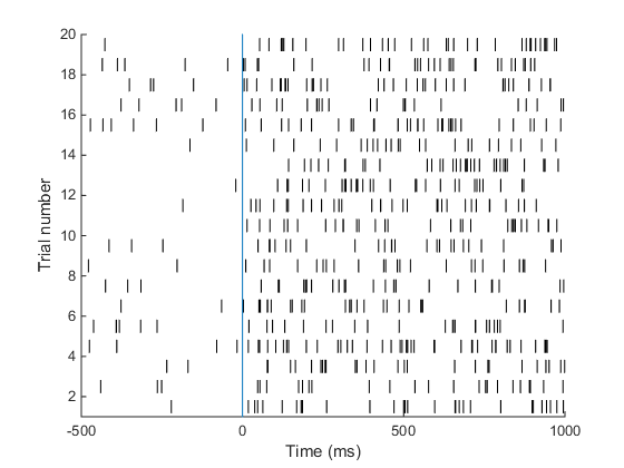
 Understanding the raster plot. In neuroscience, the words firing and spiking commonly refer to action potentials generated by a neuron. We can monitor neural activity, and therefore spikes, by placing electrodes close to a neuron in the brain. Neuroscientists commonly place electrodes in live animals (such as mice / rats / monkeys) to monitor neural activity in region(s) of the brain that are of interest to them while the animal is performing a task, e.g. dots moving on a screen are commonly used to study how the brain processes movement. In the above plot (known as a raster plot), each black bar represents one spike or action potential and each row of black bars (or a spike train) represents spiking activity of a neuron over a period of 1.5 s. This plot is a simulation of spiking activity of a neuron in an area MT (that encodes motion information) of a monkey. This neuron has a baseline firing rate of 6 Hz (meaning, the neuron fires 6 action potentials per second on average, when there is no stimulus) and increases its firing rate to 30 Hz when the monkey sees a stimulus moving at 45 degrees from horizontal (now the neuron fires 30 spikes per second on average!). Simulating spike trains like the ones in the raster plot above requires only one piece of information: the firing rate of the neuron.
Neural encoding. In this tutorial, we are interested in transforming information from the real world into spike trains. This transformation is call neural encoding. In other words, the term neural encoding refers to representing information from the physical world (such as direction of a moving stimulus) in the activity of a neuron (such as its firing rate). Encoding information in the firing rate of a neuron is commonly called rate coding.
One abstraction that I have found extremely useful while thinking about how the brain encodes information is to think of two spaces – the physical space and neural space. The physical space consists of physical properties of objects, such as direction, shape, speed, color, loudness, etc. Neural space consists of properties of a neuron / group of neurons / dendrites (depending on the context) such as firing rate (most commonly encountered), morphology, receptor density, number of spines, local field potential amplitude, etc.
Neural encoding is merely a transformation from physical space to neural space. For example, the neuron in our plot above represents a quantity from physical space (direction of a moving stimulus) as a quantity in neural space (firing rate). To understand the encoding of this neuron, we use the concept a tuning curve.
 A tuning curve is merely a graphical representation of neural encoding. On the X axis, we represent the quantity from physical space and on the Y axis we represent the quantity from neural space. In this example, we plot the neural quantity firing rate (Y axis) as a function of the physical quantity direction of motion (X axis), and each neuron will have its own tuning curve. Neuroscientists determine the tuning curve of a neuron by presenting the animal with various stimuli (varying along the X axis) while recording the activity of that neuron.
If you recall, we can simulate spike trains merely by knowing the rate at which a neuron should fire. So how does a tuning curve relate to simulating spike trains? Tuning curves translate physical quantities (direction of motion) into firing rate. Continuing our example, say we were asked to simulate a spike train for an MT neuron (whose tuning curve is given above) to a stimulus moving at a direction of 90 degrees. From the tuning curve, we see that this neuron will fire at about 45 Hz to the given stimulus. Now, we know the firing rate, and we can simulate spike trains in response to the given stimulus.
Hopefully, by now, you have understood the motivation behind simulating spike trains. Now let’s take a moment to reflect on how to simulate spike trains. We will then worry about how to implement that concept in MATLAB.
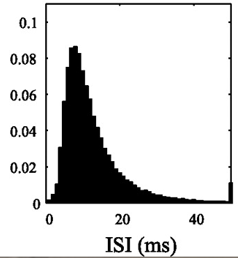
Inter spike interval (ISI). The term ISI refers to the time interval between two spikes. For a neuron firing at 8 Hz, the average time interval between two spikes is 125 ms. If we draw one spike at every 125 ms, have we simulated the activity of a neuron? In theory, yes, but the firing pattern of this neuron does not resemble that of a real neuron. When we look at firing from a real neuron and measure the ISIs, they look something like this.
 We can use a concept in probability theory known as the Poisson process to simulate spike trains that have characteristics close to real neurons. In your own time, look up Poisson process and Poisson spike generator. For now, we will use a simple formula (derived from the math that we skipped just now) to generate spikes. Here is an excerpt from Dayan and Abbott, p30 explaining how to simulate spikes.
Spike sequences can be simulated by using some estimate of the firing rate, fr, predicted from knowledge of the stimulus, to drive a Poisson process. A simple procedure for generating spikes in a computer program is based on the fact that the estimated probability of firing a spike during a short interval of duration dt is fr*dt. The program progresses through time in small steps of size dt and generates, at each time step, a random number x chosen uniformly in the range between 0 and 1. If x < fr*dt at that time step, a spike is fired; otherwise it is not.
In this technique, we are marching through time, in small steps of size dt (typically set to 1 ms) and deciding if there should be a spike at this time point. An alternative (and quicker) technique is to decide when the next spike is going to be and I for this, I recommend you read this excellent post by Jeff Preshing. In fact, I implemented this technique in the PulsePod. For the purposes of this MATLAB exercise, I will stick to the first technique.
Spikes in MATLAB!
Finally, we can get down to business. Before you open MATLAB and start typing, please make sure you recall basic MATLAB concepts such as the difference between a command window and a the editor, matrix representation of data, commonly used data types (int, char, logical, etc), MATLAB path and the difference between a MATLAB script and a function.
Represent a spike train in MATLAB. In this tutorial, we will represent spike trains in MATLAB matrices. Let each element of a matrix represent a time interval of 1 ms. If there is a spike in this time interval, then we set the value of the element to 1, else we set it to zero. Open up your MATLAB command window, type the following command-
myFirstSpikeTrain = [0 1 0 0 0 1 0 0 1 0];
If this spike train starts at time 0 and each element represents a 1 ms bin, then there are 3 spikes in this train, one between 1 and 2 ms, one between 5 and 6 ms, one between 8 and 9 ms. By looking at this 10 ms spike train alone, estimate the firing rate of this neuron (Ans: 300 Hz).
Generate a “realistic” spike train in MATLAB. Read the quotation from Dayan and Abbott once more. We can break it down into three steps
- Compute the product of fr*dt. Let’s simulate a 10 ms long spike train for a neuron firing at 100 Hz. Therefore, fr = 100 Hz, dt = 1 ms and fr*dt = 0.1 (remember that Hz is the inverse of s and 1 ms is 1/1000 s and fr*dt is therefore dimensionless).
- Generate uniformly distributed random numbers between 0 and 1. To generate random numbers, use the MATLAB function rand(). rand(1, 10) will generate 10 random numbers.
- Compare each random number to fr*dt. If the product is < fr*dt, then there is a spike! We can summarize these three steps into the code below.
fr = 100; % Hz
dt = 1/1000; % s
nBins = 10; % 10 ms spike train
myPoissonSpikeTrain = rand(1, nBins) < fr*dt;
And I got the following output (You'll obviously get something different, all zeroes is not uncommon)
myPoissonSpikeTrain =
0 1 0 0 0 0 0 0 1 0
Repeat this simulation 20 times. We could just type the commands 20 times. But it would be better to do all of it at once. For that, we will represent the data in a 2D matrix. Each row of the matrix will represent one simulation. Here is the code.
fr = 100; % Hz
dt = 1/1000; % s
nBins = 10; % 10 ms spike train
nTrials = 20; % number of simulations
spikeMat = rand(nTrials, nBins) < fr*dt;
Write the poissonSpikeGen function in MATLAB. Packaging code into functions is very useful if we want to use a piece of code repeatedly. Now let’s write a function that takes three inputs – the firing rate fr, length of the simulation tSim and number of trials nTrials. We have introduced a new variable here – length of simulation. This is simply another way of representing nBins. The number of bins is simply tSim/dt, where we have chosen dt to be 1 ms. Your function should look something like this.
function [spikeMat, tVec] = poissonSpikeGen(fr, tSim, nTrials)
dt = 1/1000; % s
nBins = floor(tSim/dt);
spikeMat = rand(nTrials, nBins) < fr*dt;
tVec = 0:dt:tSim-dt;
This function (remember that the file name of a MATLAB function should be identical to the function name!) gives two outputs – the spike matrix spikeMat and a time vector tVec, a vector describing the time stamps for each column of the 2D matrix spikeMat. In this vector, we represent the beginning time point, meaning that the interval between 10 and 11 ms will get a time stamp of 10. Since each time stamp is 1 ms long, the increment is dt. The last time stamp will start at tSim – dt representing the interval between tSim – dt and tSim.
Let’s take a moment to see why this function is useful. Suppose you are asked to simulate spike trains from a neuron firing at 30 Hz for a period of 1 s and repeat your simulation 20 times, once you have saved the poissonSpikeGen function in the MATLAB path, you can simply complete your simulation with one command in your MATLAB command window. Go on then, clear your MATLAB workspace and type the following command at the command prompt.
[spikeMat, tVec] = poissonSpikeGen(30, 1, 20);
Plot the spike matrix. Now, it would be nice if we can visualize this data! I’ve written a simple function plotRaster. Copy the code and save this function in your MATLAB path.
function [] = plotRaster(spikeMat, tVec)
hold all;
for trialCount = 1:size(spikeMat,1)
    spikePos = tVec(spikeMat(trialCount, :));
    for spikeCount = 1:length(spikePos)
        plot([spikePos(spikeCount) spikePos(spikeCount)], ...
            [trialCount-0.4 trialCount+0.4], 'k');
    end
end
ylim([0 size(spikeMat, 1)+1]);
This code simply cycles through each trial, finds all the spike times in that trial, and draws a black line for each spike. Once you have saved this function, use it to visualize the spike matrix, then label the axes. Plot the X axis in ms.
[spikeMat, tVec] = poissonSpikeGen(30, 1, 20);
plotRaster(spikeMat, tVec*1000);
xlabel('Time (ms)');
ylabel('Trial Number');
When I ran the above code, I got the following output.

Yay! that’s it!! Quite simple right? Let’s celebrate by doing another problem.
A neuron in area MT of a monkey has a baseline firing rate of 6 Hz. Upon presentation of a moving stimulus, the firing rate of this neuron increases to 30 Hz. Make a raster plot representing the firing activity of this neuron. Show baseline for 500 ms. The stimulus was presented for 1 second. Your plot should look something like this.This is the plot we set out to achieve in the beginning of this tutorial! Good job. Here is the code I used to make this plot.
% simulate the baseline period
[spikeMat_base, tVec_base] = poissonSpikeGen(6, 0.5, 20);
tVec_base = (tVec_base - tVec_base(end))*1000 - 1;

% simulate the stimulus period
[spikeMat_stim, tVec_stim] = poissonSpikeGen(30, 1, 20);
tVec_stim = tVec_stim*1000;

% put the baseline and stimulus periods together
spikeMat = [spikeMat_base spikeMat_stim];
tVec = [tVec_base tVec_stim];

% plot the raster and mark stimulus onset
plotRaster(spikeMat, tVec);
hold all;
plot([0 0], [0 size(spikeMat, 1)+1]);

% label the axes
xlabel('Time (ms)');
ylabel('Trial number');
I want to keep going, teach me more!
I applaud you if you just said that, so here are some exercises for you. I’m going to give you some exercises and what your output should look like.
In this unit, we will simulate activity of 8 neurons in area MT of a monkey, whose direction tuning properties are given to you. Download the dataset tuning.mat and load it into your MATLAB workspace. The variable tuningMat contains tuning curves of 8 neurons recorded from area MT. Each tuning curve describes each neuron’s firing rate as a function of direction of stimulus motion. For each neuron, assume that the baseline firing rate is the lowest firing rate described by the tuning curve.
(1) Plot the tuning curve of neuron 3, and label the axes. It should look like this.
(2) Plot all 8 tuning curves and use MATLAB’s plot tools to explore the tuning curves. Write down the tuning direction of each neuron. Your window should look something like this.

- Which neuron would you expect to respond best to a stimulus moving at 90 deg?
- Which neuron would you expect to have the maximum firing rate in response to a stimulus moving at an angle of 225 degrees?
(3) Simulate firing in each of the 8 neurons (500 ms baseline) to a single presentation of a 1 s long stimulus moving at an angle of 90 degrees. Which neuron would you expect to respond best to this stimulus?

(4) Repeat the stimulation for a stimulus moving at an angle of 270 degrees.
 Can you infer the direction of the stimulus by looking at the firing patterns of these 8 neurons?
(5) Simulate firing in all 8 neurons over 30 trials for a 1 s long stimulus moving at an angle of 180 degrees. It should look something like this.

Hope you enjoyed doing these exercises. Happy simulations!